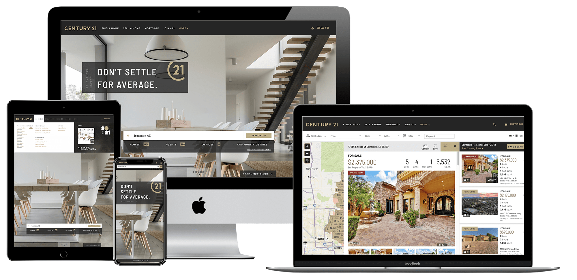
Our team was tasked with redesigning the Century21.com website after a long-overdue brand refresh.
The new brand was developed around the disconnect between the investment people make in buying or selling a home and the perceived value they receive from finding the right real estate agent who fits their needs.
As part of the brand campaign, Century 21 Real Estate introduced a sophisticated new logo. The logo features a refreshed color palette that stays true to its iconic gold and black scheme, while also embracing new graphics. By eliminating the complexity and dated iconography, the new identity gives CENTURY 21 System members a clear stage for their unique personalities and styles to shine through, while still providing a simple and timeless “gold standard” seal of approval. Additionally, the new logo enables the brand to project a modern view that makes it relevant to consumers buying other properties, such as apartments or commercial spaces.
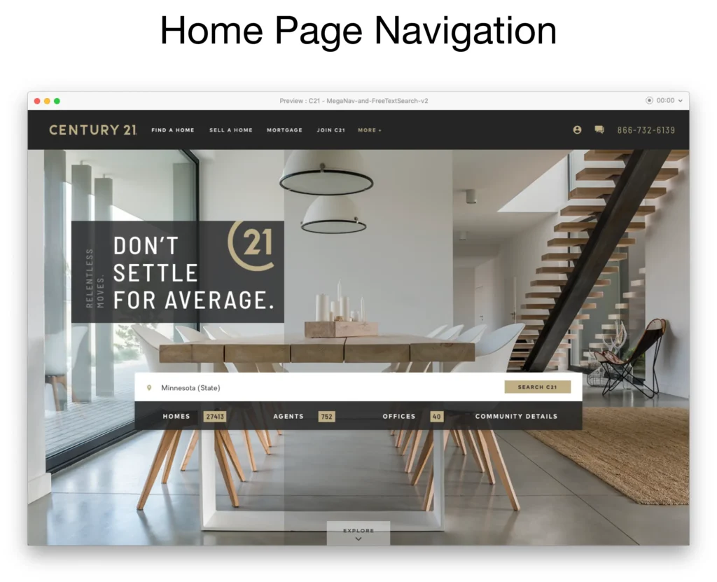
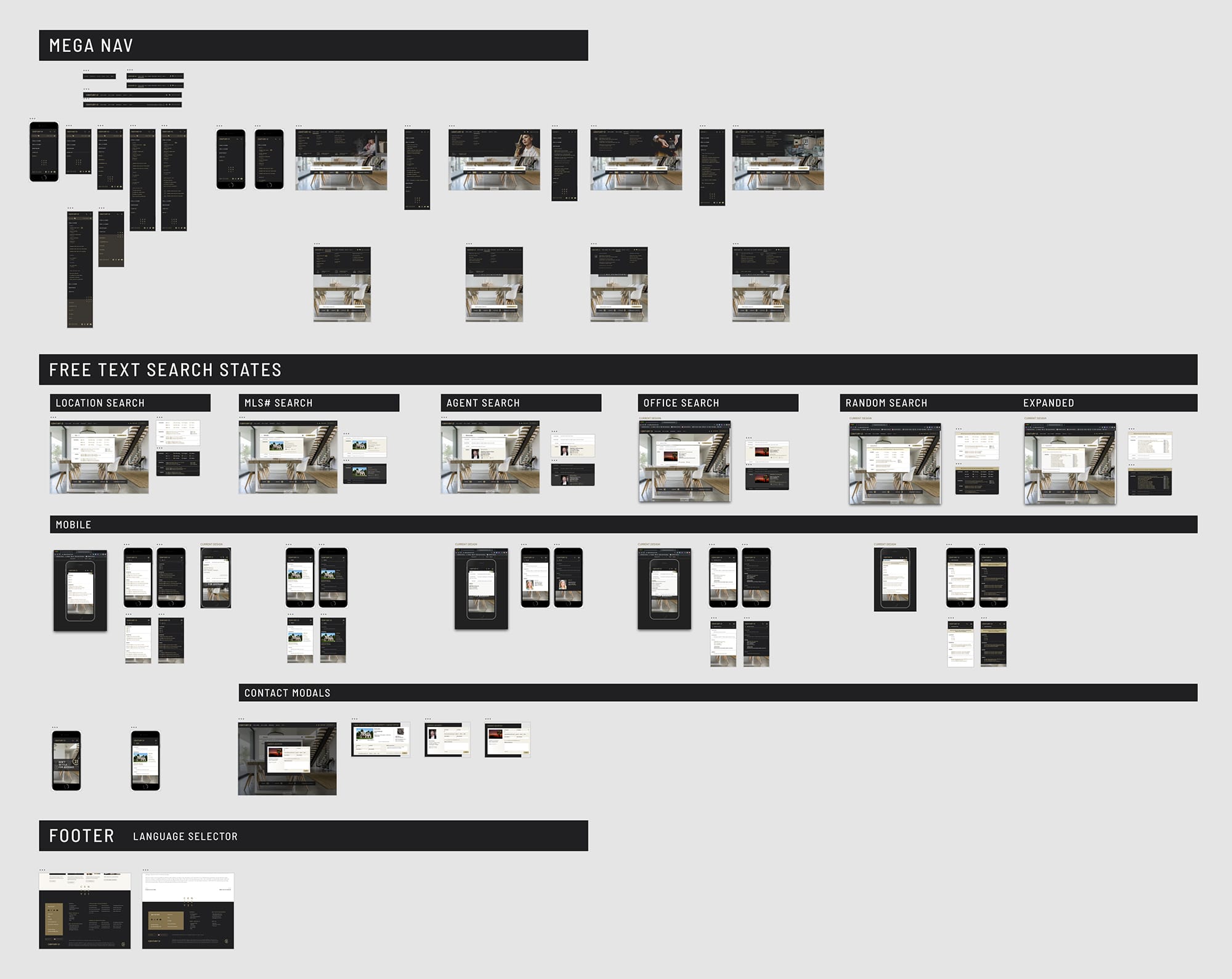
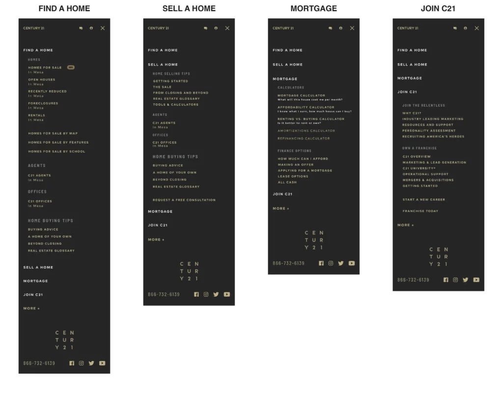
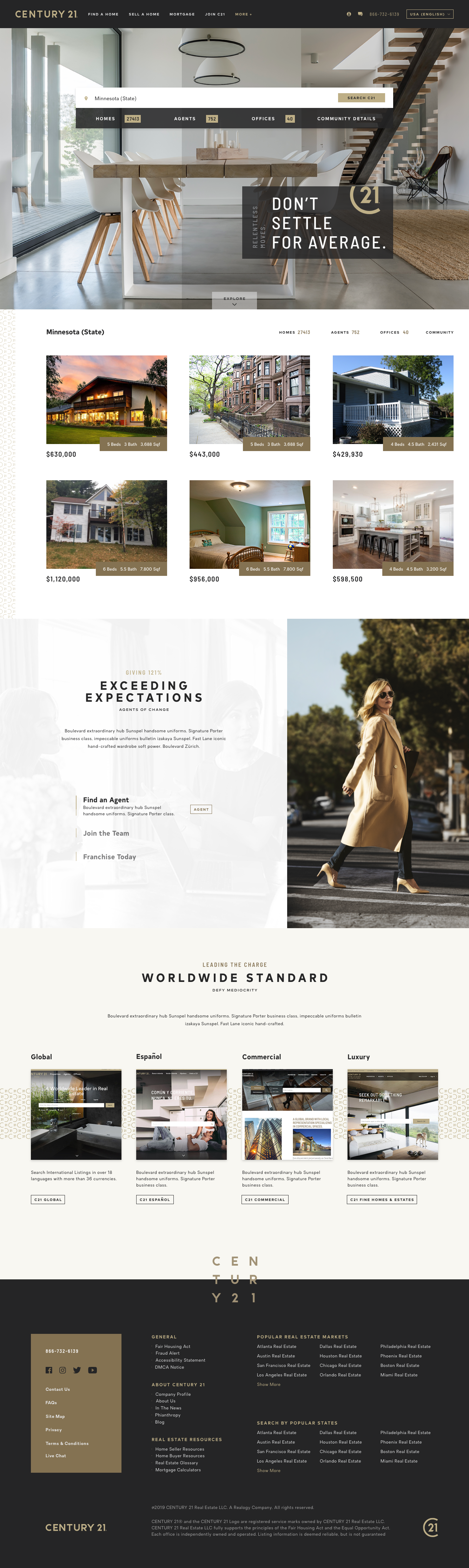
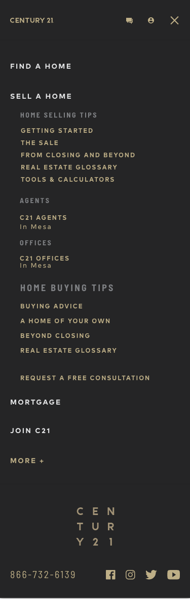
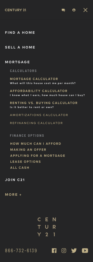
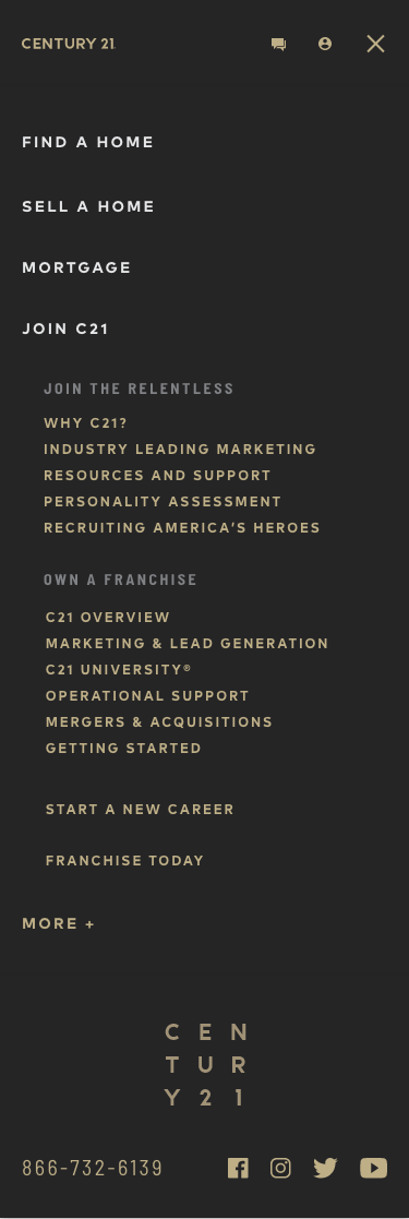
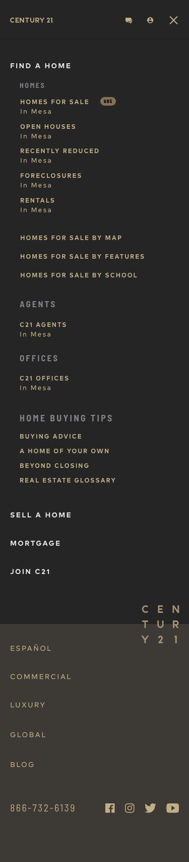
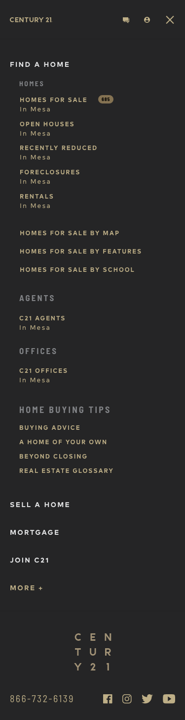
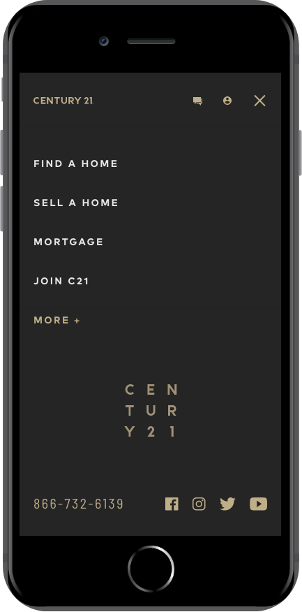
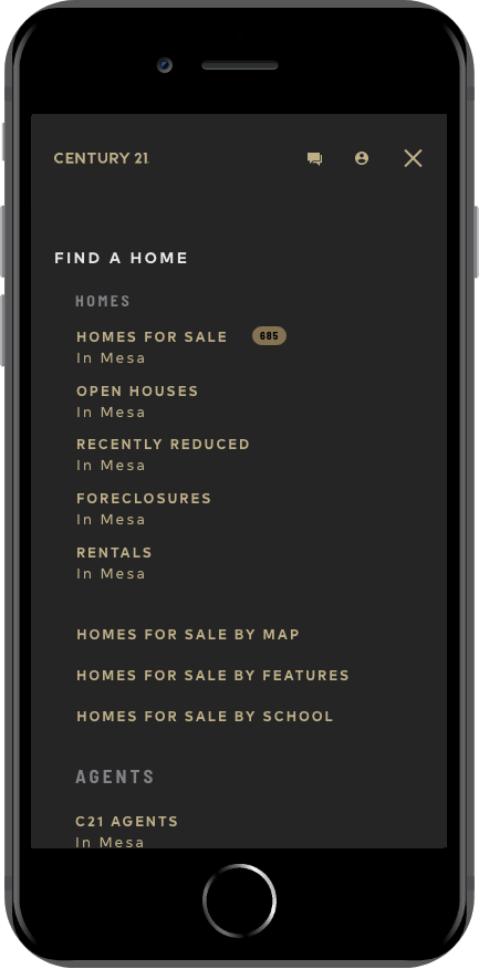
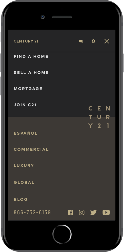
We designed a sleek and modern navigation that puts the most important information front and center.
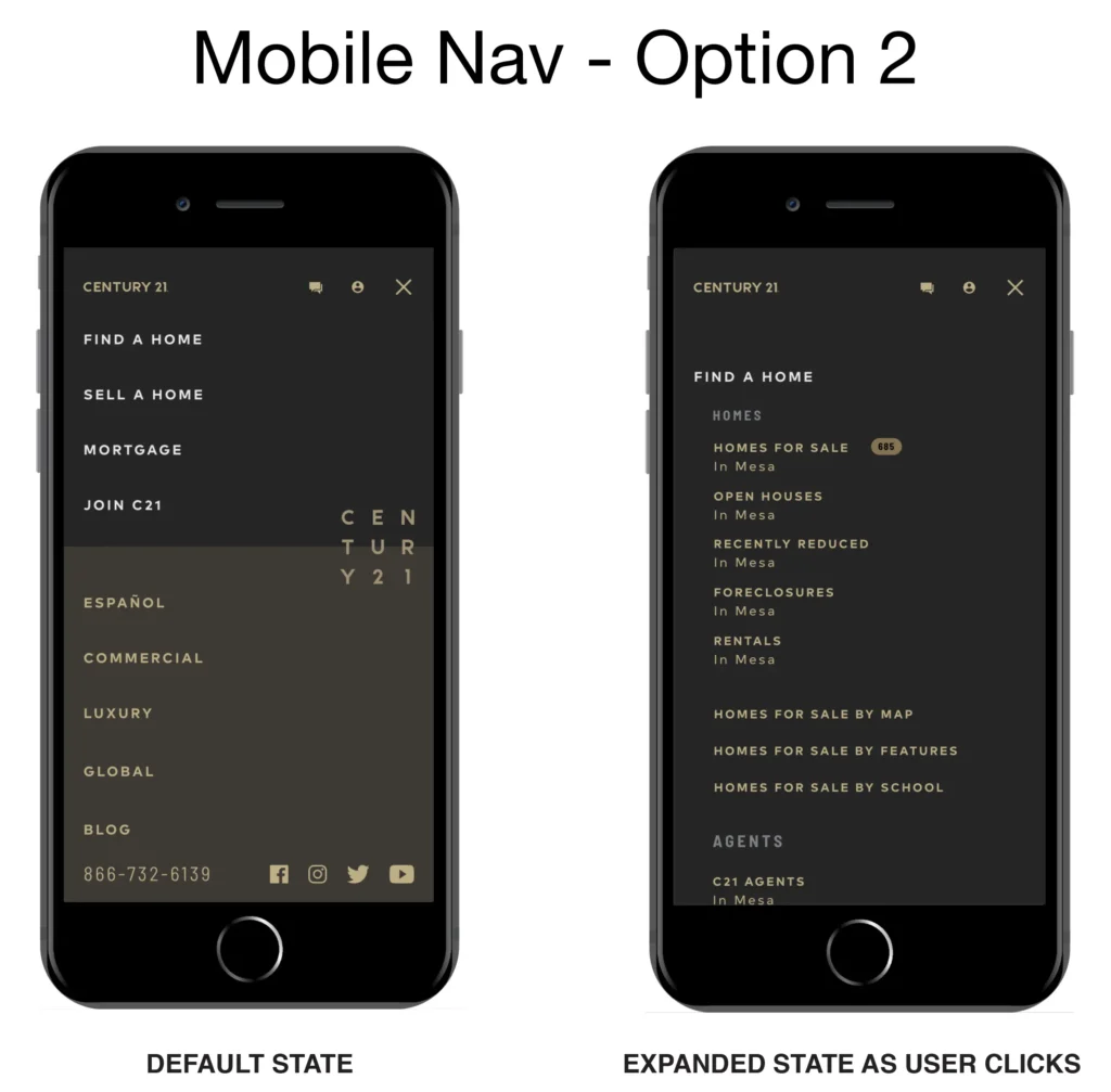
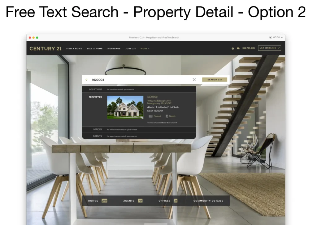
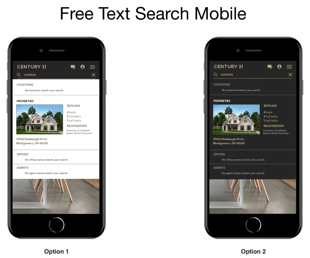
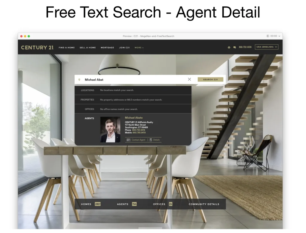
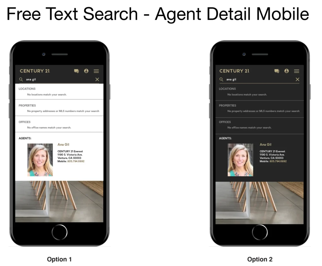
The Free Text Search would allow the user to search for homes, agents, and offices via the same input search field. Depending on the type of information that was entered, the live search would populate below showing information in their respective rows. Through research and analytics, we knew that a large percentage of searches were being done on a mobile device it was important that functionality and user experience would not be limited or different from the desktop browsing experience for consistency’s sake.